Blogs
Stitching Texts, Stitching Bodies: On Printing Frankenstein (at 200)
Guest blog by Giorgina Paiella
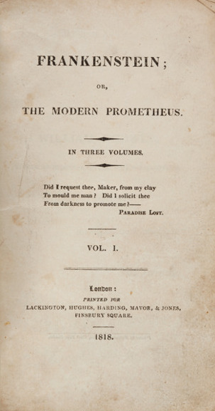
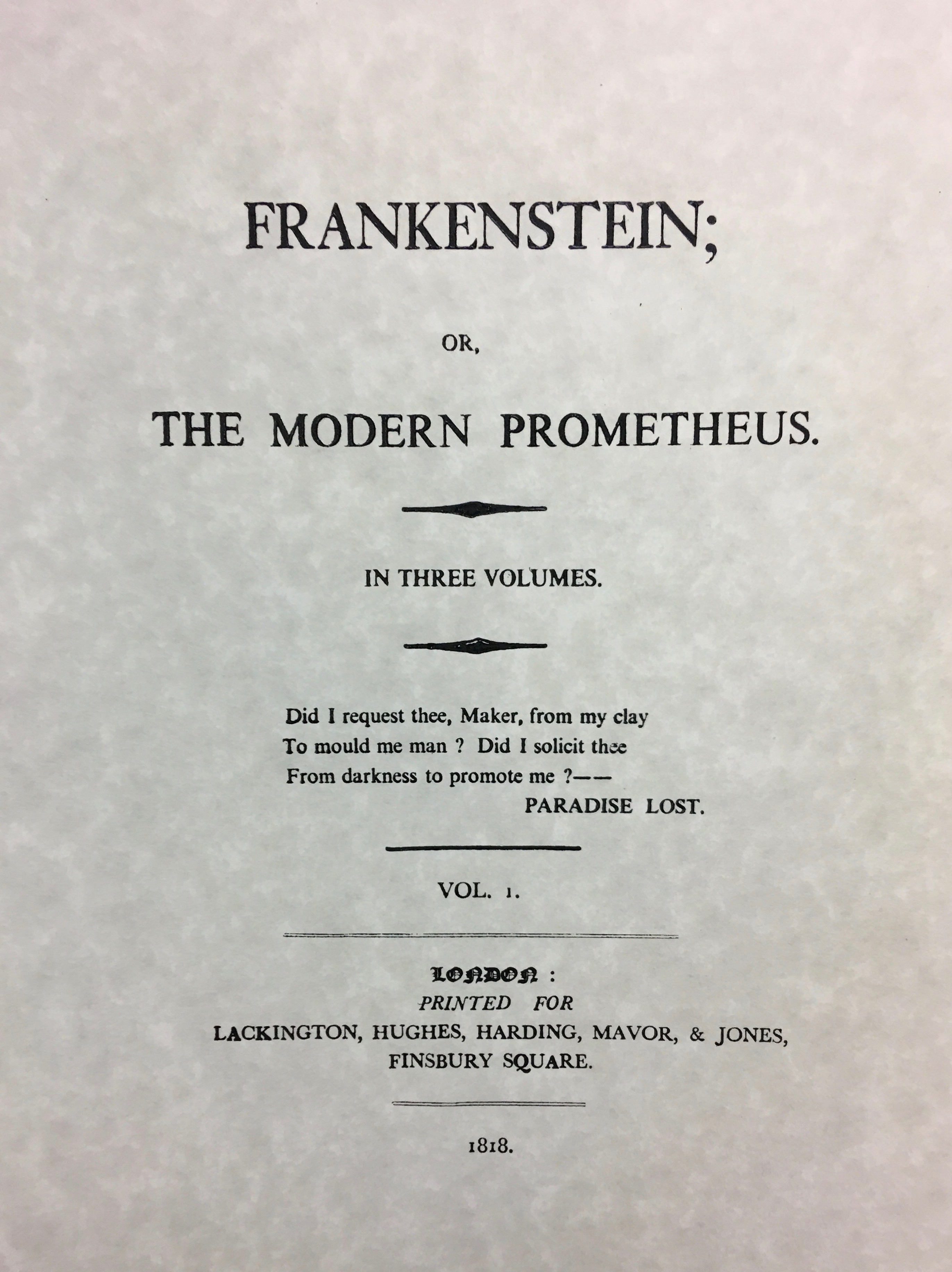
The title page to Mary Shelley’s 1818 edition of Frankenstein. Credit:Heritage Auctions.
“Did I request thee, Maker, from my clay
To mould me man? Did I solicit thee
From darkness to promote me?”
—John Milton, Paradise Lost; Epigraph to Mary Shelley’s Frankenstein
On January 1st, 1818, Mary Shelley’s Frankenstein was first published anonymously in a 500-copy edition by the small London publishing house of Lackington, Hughes, Harding, Mavor, & Jones. The text’s humble origins couldn’t have predicted the immense post-publication success and legacy of Shelley’s novel, which is celebrating its bicentennial this year.
In honor of the bicentennial, I taught an Introduction to Literary Studies course this summer in the English department at the University of California, Santa Barbara (UCSB). Using Shelley’s Frankenstein as our primary literary text, my course explored the rich critical conversation and multiplicity of readings centered on—and generated from—Shelley’s text, while also exploring the extensive influence of Frankenstein on a diversity of academic fields, from literary studies to the history of science, bioethics to gender studies, science fiction to technology studies—in addition to its massive influence on popular culture.
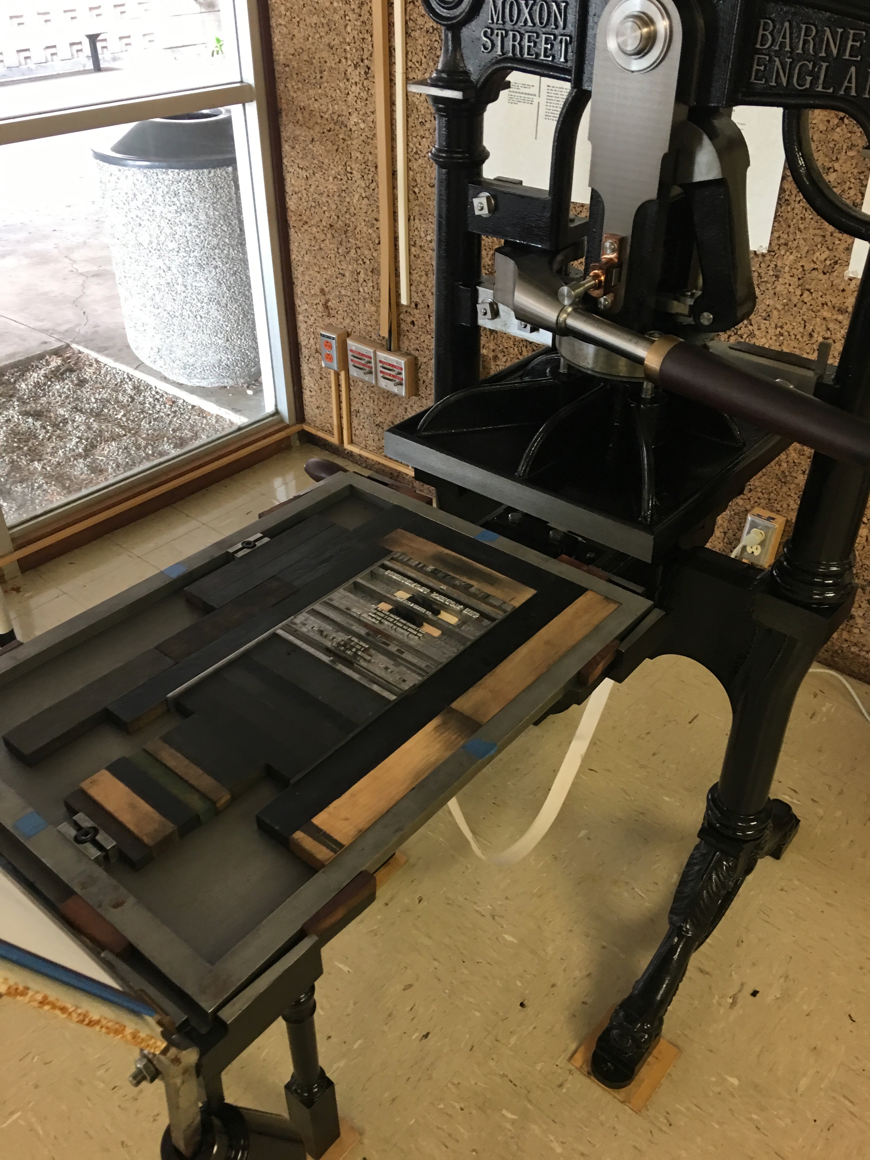
As I prepared for my course, I wanted to utilize and spotlight the many interdisciplinary spaces and resources that speak to Frankenstein close to home. One such space is the Maker Lab, a printing lab and makerspace that boasts a working replica of a mid-19th century Albion pull-press (affectionately nicknamed Mad Madge) that arrived on the UCSB campus last year, thanks to Professor of English Patricia Fumerton and Dean of Humanities and Fine Arts John Majewski.
I set out to print the title page to Shelley’s 1818 Frankenstein, curious about what this exercise in print history and making would allow me to reflect upon at this literary milestone. What could this experience teach me about print? About hybridity? About makerspaces and craft? My goal was never perfect font matching or absolute fidelity, but rather an opportunity to learn about—and reflect upon—the process of making Frankenstein 200 years on.
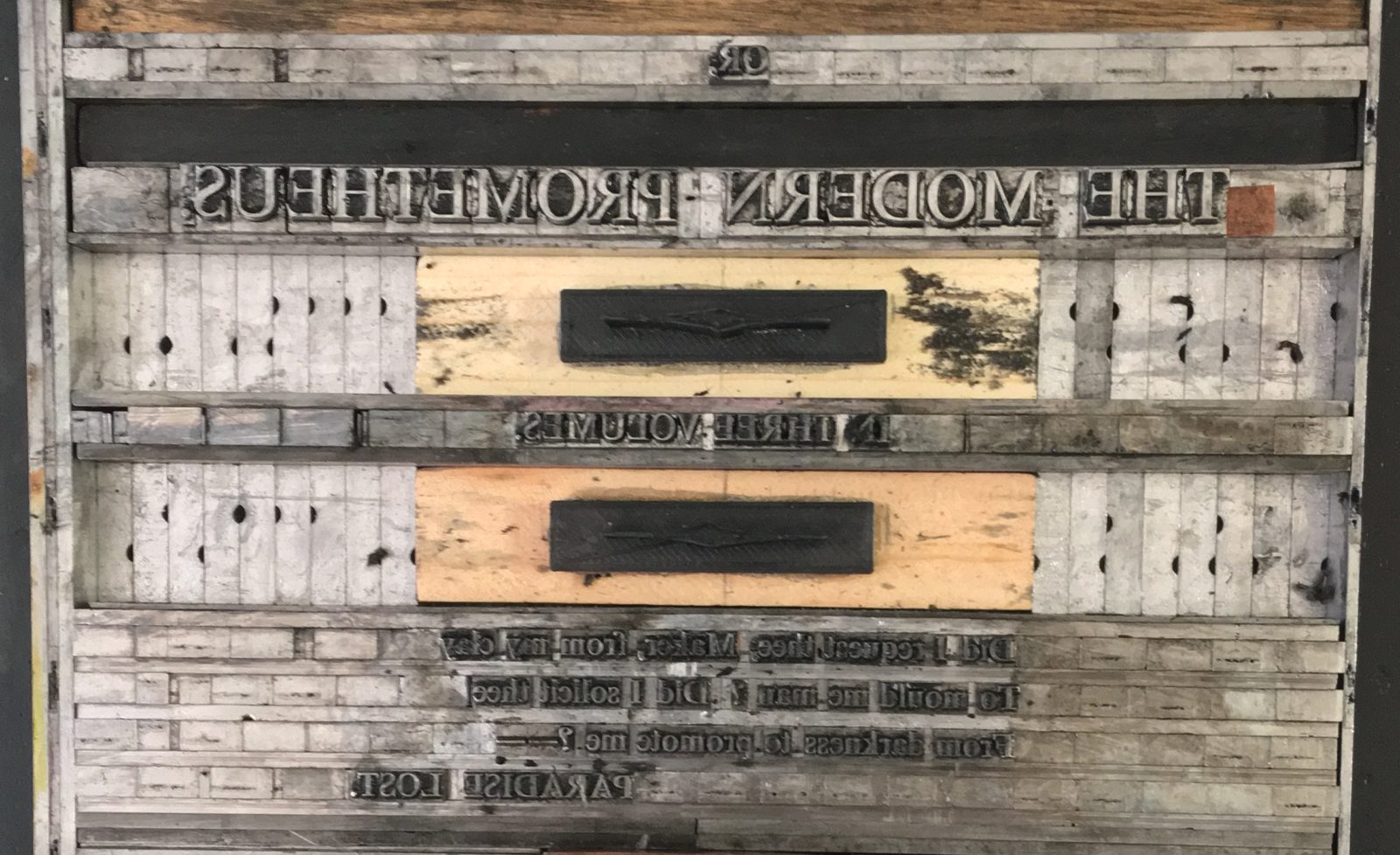
Typesetting my recreated Frankenstein title page. Credit: Giorgina Paiella.
I was trained in the Maker Lab by Katie Adkison, a fellow PhD student in the English department, who showed me how to set type, ink, and print on the press. The Maker Lab and the UCSB College of Creative Studies print lab had type that was similar enough to the font used in the Frankenstein title page. There were no ornamental designs readily available that resemble the shapes that bookend the “In Three Volumes” on the original 1818 title page, however, so I had to create them from scratch. After consulting with printing experts on campus, another fellow English PhD student, Tyler Shoemaker, helped me render the design in Tinkercad into a printable object that could then be printed on the Maker Lab’s 3D printer. Once the shapes were printed, English PhD student Kristy McCants instructed me on how to mount the printed ornaments on blocks of wood and then sand them down to type high. After many hours spent swapping out fonts letter by letter, correcting typos, and tweaking as I went, the composite page was then ready to ink and print.
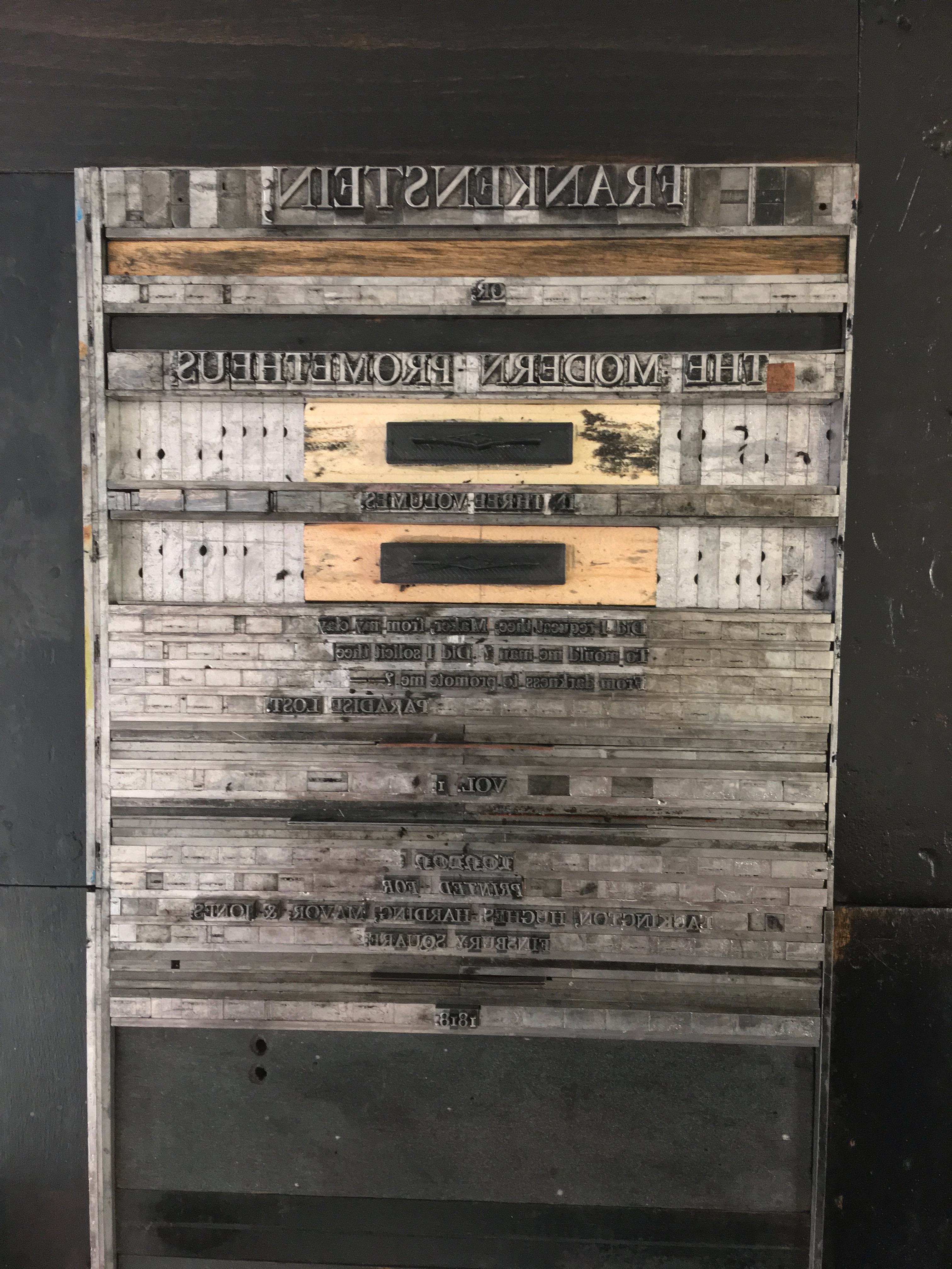
Loading the typeset title page into the UCSB Maker Lab printing press. Credit: Giorgina Paiella.
In Shelley’s Frankenstein, eponymous creator Victor Frankenstein undergoes a painstaking process to create his creature, selecting the most beautiful human body parts from “vaults and charnel houses” with the goal of animating the parts to create an equally beautiful living being. Victor’s hope, of course, goes horribly awry, instead producing a creature monstrous in both proportion and features. As I looked at the final printed title page, with its hybrid old methods and forms (type, printing, and printing press) and new (3D printed objects), I immediately thought that the typesetting of the title page was a Frankensteinian endeavor in itself, not unlike the creation of the creature. Combining old and new technologies, old parts are metaphorically stitched together to make a hybrid, yet (with any luck), unified novel object. The precision required for printing—selecting font, typesetting letters and spaces by hand to build the page—feels like an especially apt metaphor for assembling the title page of a novel so deeply invested in making.
This stitching together, in Shelley’s fictional narrative and in printing practice, also bears on the meaning and making of text itself. In his exploration of the etymology of “text” in his Bibliography and the Sociology of Texts, D.F. McKenzie identifies its origin rooted in the Latin texere—to weave. My experiences in printing demonstrated that it is perhaps this woven quality that is the most unifying universal element of texts across media forms and time. And this woven nature of text is even more complexly layered in Shelley’s novel, a text characterized by its nested narrative framework and interpretive multiplicities that are so abundant that they border on the monstrous. The text enacts in its form and many possible readings the infamous act of creation at the heart of Shelley’s tale that has captivated the popular imagination for two centuries. Trying to create anew the title page of this canonical 1818 text in 2018 upon a replica 19th century printing press, stitching texts and stitching bodies seem more closely aligned than ever—both deeply woven, and interwoven, things and processes.
My final printed title page of Shelley’s 1818 Frankenstein. Credit: Giorgina Paiella.
Giorgina Paiella is a PhD student in the English Department at the University of California, Santa Barbara. Her research focuses on the long eighteenth century, the digital humanities, cognitive science, and gender studies, with a particular focus on the intersection of gender and automation and artificial intelligence.